Hallucinating with ChatGPT

Natural language generation has improved remarkably over the last decade and OpenAI’s ChatGPT showcases an unbelievable performance of state-of-the art systems. Like many curious people over the last month, I played with ChatGPT from time to time. It’s super impressive – it can create poems, write prose in nearly any style, and provide detailed answers to all sorts of questions. Oh, and it’s also an amazing bullshit artist and it will lie with abandon.

I decided to ask ChatGPT a specific question about particle physics that is a bit subtle but has a straightforward answer. ChatGPT’s response is stunning bullshit.

ChatGPT gets the first part right – the most common decay mode is to an electron, an electron antineutrino, and a muon neutrino. Now, the rest of the answer is completely wrong. First, the muon is kinematically forbidden from decaying into pions. The muon is simply not massive enough to do so. Second, even if the muon were massive enough to decay with three charged pions in the final state (like the tau lepton can), conservation of lepton number still requires neutrinos. Apparently ChatGPT has thrown lepton number overboard so that it can give me an answer!

The correct answer to my quetsion is: Theoretically yes, but hopelessly rare. No observation of muon decay without emitting neutrinos has ever been observed.

In the Standard Model (the theory of fundamental particle interactions) with massless neutrinos, muon decay must include neutrinos in the final state. The Standard Model with massless neutrinos conserves family lepton number and so neutrinos in the final state are required to conserve muon and electron number (a muon neutrino and an electron antineutrino). However, neutrino flavour oscillation observations tell us that neutrinos have very, very tiny masses. Extending the Standard Model to include neutrino masses allows for the muon to decay without neutrinos (for example to an electron and a photon) but at rates so extremely small that we have no hope of observing neutrinoless decays of the muon unless the Standard Model is further extended with exotic physics.

Ok, rather technical stuff. But where did ChatGPT come up with the idea of pions in the final state? Well, I asked it. And sure enough ChatGPT came up with references, including a paper in Nature from 1982 with claims of actually observing neutrinoless decays of the muon! Well, either I missed something during my PhD and postdocs (I have done a fair amount of work on supersymmetric extensions of the Standard Model with enhanced flavour violating decays of the muon) or ChatGPT is making stuff up. All of the references that ChaptGPT gave me are complete fabrications – they don’t exist!!

It turns out that natural language generation in systems like ChatGPT suffer from hallucinating unintended text. Its creative power, its ability to write poems etc., requires such an enormous amount of flexibility that ChatGPT seems to start making things up to complete an answer. I’m not an expert on natural language processing, but I know that researchers are aware of the phenomenon.

I happen to know something about particle physics so it’s not a big deal that ChatGPT fibbed to answer my question. In fairness, my question is a bit subtle (short answer is No with an if, long answer is Yes with a but). But imagine circumstances that are more important. How do you know if you can trust the answers? Asking it for reference doesn’t seem to help.

To me the lesson is that systems like ChatGPT are going to be ever more useful with the potential to make life much more convenient. But these systems are not a substitute for human cognition. For the teachers out there – don’t worry about ChatGPT writing your students’ essays, just check to see if the references exist!

Update (February 23, 2023)

I returned to ChatGPT last night, getting into a discussion with it about the top quark. ChatGPT continued to give insane answers about QCD, electroweak physics, and the nature of the Higgs sector. I thought I could get it on track if it would just realize that the muon’s mass is less than the pions. It produced this gem:

ChatGPT fails the Piaget test.

The Piaget test.

AWS EC2 with RStudio login through a browser

Over the course of the last few years, I have become reliant on AWS for running large jobs. The COVID-19 modelling work I was involved with required some high performance computing and AWS is an excellent solution.

There are some great resources for getting started with AWS EC2. I highly recommend the site, Running R on AWS EC2 and Logging into RStudio from Anywhere, for details on how to get an instance with R and RStudio up and running in a step-by-step fashion.

I have created a Bash script (see below) that you can scp to your instance and run. It will set up an instance with R, RStudio IDE that you can log into through a browser, and a Shiny server. Make sure to open port 80 (HTTP) and add custom TCP rules for ports 8787 and 3838 in the security configuration details through your EC2 dashboard. RStudio will run through port 8787 and Shiny through 3838. Also, ensure that you make the script executable with the command: chmod +x aws_R_setup.sh (or whatever you choose to call the bash script).

Once you have run the script, add a user (e.g. sudo adduser rstudiouser) and then add the new user to the sudo group. The commands are at the bottom of the script commented out.

After you have set the user, login to RStudio through your browser using your ec2 address with port 8787 (e.g., ec2-35-183-78-154.ca-central-1.compute.amazonaws.com:8787). And volia! You will have the RStudio IDE running through your browser that you login to using the username and password you created. For the Shiny server, access using port 3838 (e.g., ec2-35-183-78-154.ca-central-1.compute.amazonaws.com:3838).

Of course it is always possible to use an existing AMI on EC2, but having the flexibility to create your own system can sometimes be useful.

#EC2 script for setting up an R instance on AWS
totalmem=$(free -g | grep -oP '\d+' | head -n 1)
if [ "$totalmem" -lt "2" ]; then
	sudo /bin/dd if=/dev/zero of=/var/swap.1 bs=1M count=2048
	sudo /sbin/mkswap /var/swap.1
	sudo /sbin/swapon /var/swap.1
	sudo sh -c 'echo "/var/swap.1 swap swap defaults 0 0 " >> /etc/fstab'
	sudo echo "created swap file memory to avoid using bigger instance"
fi

sudo apt-key adv --keyserver keyserver.ubuntu.com --recv-keys E298A3A825C0D65DFD57CBB651716619E084DAB9

sudo add-apt-repository 'deb https://cloud.r-project.org/bin/linux/ubuntu focal-cran40/'

# Update ubuntu package repo, to get latest R
sudo apt -y update
sudo apt -y upgrade

# Install R
sudo apt -y install r-base r-base-dev

# Install shiny before shiny-server
sudo R -e "install.packages('shiny')"

# Install debian package manager, gdebi
sudo apt install gdebi-core


# Install Shiny Server 
wget https://download3.rstudio.org/ubuntu-14.04/x86_64/shiny-server-1.5.16.958-amd64.deb
sudo gdebi shiny-server-1.5.16.958-amd64.deb
sudo rm shiny-server-1.5.16.958-amd64.deb

sudo apt -y install libcurl4-openssl-dev 

sudo apt -y install libssl-dev libxml2-dev libmariadbclient-dev build-essential libcurl4-gnutls-dev


# Install RStudio

wget https://download2.rstudio.org/server/bionic/amd64/rstudio-server-1.4.1717-amd64.deb
sudo gdebi rstudio-server-1.4.1717-amd64.deb
sudo rm rstudio-server-1.4.1717-amd64.deb


sudo R -e "install.packages('RCurl', repos='http://cran.rstudio.com')"
sudo R -e "install.packages('devtools', repos='http://cran.rstudio.com')"
sudo R -e "install.packages('tidyverse')"

sudo apt -y install default-jdk
sudo R CMD javareconf


# Change permissions for R library
sudo chmod 777 -R /usr/local/lib/R/site-library

#Now add user info to login RStudio for example:
#sudo adduser rstudiouser

#Then add rstudiouser to sudo group:
#sudo usermod -aG sudo rstudiouser


Ontario ICU arrivals and departures as a Skellam process

Figure 1: Net daily change in the Ontario ICU census with Skellam inferred rates. The red lollipop points are days of net inflow and blue lollipop points are days of net outflow. The red ribbon and blue ribbons are the inferred daily ICU arrival and departure rates from the Skellam process. Lockdown imposition and lifting dates indicated.

As Ontario enters a new lockdown, the main concern is a potential overrun of our ICU capacity. A year ago, the Ontario government announced a planned major expansion of provincial ICU capacity, but, given our current limits, it appears that either the plan never came to fruition or that the efforts woefully underestimated possible COVID-19 ICU demand. The Ontario COVID-19 data portal gives the daily ICU COVID-19 census from which we can compute daily changes. As of April 4, Ontario has 451 ICU patients associated with COVID-19. The daily changes give us the net flow but the counting does not tell us how many people actually arrived or departed each day. When we see a daily uptick of 25 people, is that 25 arrivals with no departures or is it 50 arrivals with 25 departures? Both scenarios give the same net change.

Even though the COVID-19 data shows only the net change, we can infer the arrival and departure rates using the Skellam distribution. The Skellam distribution is the difference of two Poisson distributions, k = n_1 - n_2, given by the convolution with a negative sum, namely,

(1)   \begin{equation*} s(k; \mu_1,\mu_2) = \sum_{n=-\infty}^\infty\, p(k+n; \mu_1) p(n; \mu_2),\end{equation*}

where s(k; \mu_1, \mu_2) has support on \{\ldots, -2,-1,0,1,2,\dots\}, and p(k;\mu) = \frac{\mu^k}{k!}e^{-\mu} is the Poisson. The resulting distribution can be expressed in terms of the modified Bessel function,

(2)   \begin{equation*}s(k; \mu_1, \mu_2) = e^{-(\mu_1 + \mu_2)}\left(\frac{\mu_1}{\mu_2}\right)^{k/2} I_{|k|}(2\sqrt{\mu_1\mu_2}) .\end{equation*}

I take the daily difference in the Ontario ICU census data and estimate the Skellam distribution over a 21 day sliding window. The Skellam parameters are the ribbons in figure 1, smoothed with cubic splines with cross validation, and superimposed on the daily net flow. The red ribbon is the arrival process and the blue ribbon is the departure process. Each lollipop point is the net change in the ICU occupation on that day. In figure 2 I show a Q-Q plot of the Pearson residuals from the Skellam model – the model is a reasonably good description of the data generating process. In my analysis I use the R packages Skellam and mgcv (for spline estimation). For clarity, I indicate the lockdown imposition and lockdown lift dates. As of early April 2021, it looks like we are approaching an average of 50 admissions to the ICU every day with an average departure of about 40.

Figure 2: Regression diagnostics

Causation is hard to determine in regressions such as this model, but we see that after the lockdown date on December 26, 2020, the arrival rate quickly plateaued only to begin rising again near the end of the lockdown period. It appears that the lockdown this winter had the effect of tempering arrivals into the ICU. But as always with statistics, we need to be cautious about making causal statements. The arrivals in the ICU are from people who were infected at an earlier date, probably in the neighbourhood of one week earlier. Thus, we see that the arrival rate remains high from the beginning of the lockdown on December 26 through the end of December and early January. We should expect this inertia from infections that occurred near or before the imposition of the lockdown, although there is a distinct possibility that people started to change their behaviour before the lockdown date. But notice that the arrival rate begins to rise sharply almost exactly coincidental with the end of the lockdown on February 16, 2021. This observation suggests that infections were beginning to accelerate at least a week, maybe two, prior to the end of the lockdown. It appears that we would have seen a surge at some level in Ontario’s ICUs even if the lockdown had been maintained through the end of February or longer. Of course it’s quite probable that the resulting surge would have been smaller than the one we are currently witnessing, but to gain insight into such a counterfactual we need to know what caused the acceleration in infections prior to the end of the lockdown. If infections started to rise before the end of the lockdown, is it the result of the new more contagious variants? Is it lockdown fatigue? Is it spread among essential workers? Maybe it’s a combination of effects; I don’t know. Lockdown efficacy rests on that understanding.

Notice that the arrival process turned downward, or at least plateaued, about two weeks after the lockdown date of December 26, 2020, but also notice that the daily number of departures has been steadily increasing throughout the entire winter. Of course we expect that as arrivals increase, departures will eventually increase as well – everyone who enters the ICU eventually leaves. In a steady-state queue, the average departure rate will equal the average arrival rate. With time variation in the arrival process the departure rate will lag as the arrival rate waxes and wanes. It might be instructive to think about the average server load (ICU occupation) of an M/M/c queue (exponentially distributed arrival time, exponentially distributed server times, with c servers) as an approximation to the ICU dynamics. In an M/M/c queue the average number of busy servers (ICU bed occupation) is,

(3)   \begin{equation*} \bar c = \frac{\mu}{\tau}, \end{equation*}

where \mu is the arrival rate and \tau is the average service rate. For example, given an arrival rate of 50 people per day and an average length of stay of 14 days in the ICU, the steady-state average number of people in the ICU would be 700 patients, provided the number of beds (servers) is larger than 700. I don’t know if the length of stay has been varying over time. It would be great to do a full time dependent competing risk survival analysis on that data, but the steady rise in the departure rate that we see over the winter might indicate that the length of stay in the ICU has also been changing with the arrival rate. I don’t know.

There are a number of ways to extend this work. The estimator is crude – instead of a naive 21 day sliding window, it could be built with a Bayesian filter. The Q-Q plot in figure 2 shows that the naive sliding window generates a good fit to the data but if we want to back-out robust estimates of the timing of the infections associated with the arrivals, it might be worth exploring filtering. Second, it is possible to promote the parameters of the Skellam process to functions of other observables such as positive test rates, lagged test rates, time, or any other appropriate regressor and then estimate the model through non-linear minimization. In fact, initially I approached the problem using a polynomial basis over time with regression coefficients, but the sliding window generates a better fit.

Where does this leave us? The precipitous drop in ICU arrivals throughout the summer of 2020 with low social distancing stringency and no lockdowns, along with the steady rise in arrivals beginning in the fall, suggest that Covid-19 will become part of the panoply of seasonal respiratory viruses that appear each year. Hopefully with the vaccines and natural exposure, future seasonal case loads will occur with muted numbers relative to our current experience. Given that the largest mitigating effect, next to vaccines, seems to be the arrival of spring and summer, lockdown or not, the warming weather accompanied by greater opportunities to be outdoors should have a positive effect. Covid-19 cases are plummeting across the southern US states like Texas and Alabama, yet cases are rising in colder northern states like New York and New Jersey. While increased herd immunity in the US from higher levels of vaccination and higher levels of natural exposure must be having an effect on reducing spread, it really does seem like Covid-19 behaves as a seasonal respiratory illness. Hopefully we can expect better days ahead, but, in the end, it is very hard to maintain a large susceptible population in the face of a highly contagious virus that has already become widespread. Perhaps we should have been looking for better public health policies all along.

COVID-19 death count conspiracy theories don’t add up, but won’t someone think of the children?

The Canadian media reminds us daily of the COVID-19 death count. They never fail to mention each time we reach a grim milestone. But I got to thinking, how are COVID-19 deaths really counted? What is the effect size on mortality? In some cases it might be obvious, but I am sure there are many medical cases which are difficult to label, especially since severe illness from COVID-19 strongly tracks the febrile, people with comorbidities, and people of advanced age. Are we under-counting or over-counting COVID-19 deaths? Conspiracy theories abound with wild claims about COVID-19 inflated death counts.

One way we might be able to help calibrate our counting is looking into changes in the Canadian mortality rate. Sure, labelling a COVID-19 death might be difficult, but counting deaths themselves should be much easier. Statistics Canada has several weekly mortality time series for the Canadian population. Using the website https://www.mortality.org/, I download the Statistics Canada mortality data. I have no way of determining the data accuracy, but I will assume that the data are complete enough for my modelling purposes. As always, conclusions are only as good as the data we have.

The first plot shows the raw Statistics Canada mortality rate data. The data are split across cohorts along with the total population. We see some interesting patterns. First, the mortality rate in Canada has been increasing over the last ten years. This increase is not surprising as Canada’s median age is increasing – the effect is probably due to our aging population. Second, the death rate in our oldest cohorts is decreasing. We are probably seeing healthier people reaching these cohorts each year given that smoking rates decreased over the last 30 years and we are probably also seeing the effect of better medicine. That we see declines in the mortality rate of the oldest cohorts but an increasing rate for the entire population is an example of Simpson’s Paradox. The fraction of the Canadian population entering the oldest cohorts is increasing, but we all die at some point!

Annualized Canadian mortality rates by cohort with weekly observations.

A casual glance at the plot doesn’t seem to scream a large COVID-19 effect in 2020, but we have to be careful – looks can be deceiving. We have a long term trend superimposed on a noisy periodic time series and we are trying to detect changes at the tail end of the process. A nice way to proceed is to use generalized additive models (GAM). I will be using Simon Wood’s mgcv R package.

The model I have in mind is a GAM with a cyclic cubic spline with a 52 week period, s_1, and a trend spline, s_2,

(1)   \begin{equation*}\text{rate}_i = s_1(\text{week.number}_i) + s_2(\text{time}_i) + \epsilon_i.\end{equation*}

It’s a simple model, but it should be able to pull out a signal or trend, if one exists.

Given that COVID-19 has proven more dangerous to the 75-84 year old cohort, I will start there. The second plot shows the results of the model normalized to the downward linear drift in the data. My model does well fitting the data – well enough to understand the broad features – but an examination of the residuals, while normal in their distribution, exhibit some autocorrelation. There is subtle time series structure that my model misses but for the purposes of detecting the long term trend, this model does reasonably well. We see that the cyclic part peaks during the fall/winter, and the spline trend term sharply moves up through 2020, the effect from COVID-19. The trend component also shows the years with a particularly strong flu season.

GAM: Cyclic and trend components with normalized mortality data for 75-84 year old cohort.

In the next figure I show the long term trend in the mortality rate for the 75-84 year old cohort relative to the background. We see that COVID-19 has lifted the mortality rate for this group by about 4.5%, about 4 times the effect of a bad flu year. The final figure shows the long term trend with the original data. Repeating this analysis for the entire population, we see that the over all effect of COVID-19 on the Canadian population is to lift the mortality rate by about 5% above background. We can see the effect in the next two figures.

GAM trend component relative to the background mortality rate in the 75-84 year old cohort.

This helps us answer the question about over counting. If the effect is about 5% and if it sustains for all of 2020, given that about 280,000 Canadians died in 2019, the results suggest that the annual total COVID-19 effect is 15,000 excess in Canada. While it looks like the current official number of 21,000 COVID-19 deaths might be a little bit high, we need to caution that conclusion based on substitution effects. People travelled less in 2020, so some types of accidents are probably down with deaths from COVID-19 making up part of the difference. Those types of substitution effects would mask the severity of COVID-19 in the mortality rate data. On the other hand, there are other substitution effects, such as self-harm, that have probably increased over 2020, which push up the overall mortality rate from non-COVID-19 (or at least indirect) causes. A much more detailed analysis of all the substitution effects would be required to really know just how much over or under counting is present in the COVID-19 death totals. The official count broadly concords with my simple GAM analysis on the mortality rate. My guess is that if there is bias in the official tally, it would probably lean a touch in the over counting direction, but nothing like the crazy conspiracy theories.

GAM: inferred trend in the mortality rate for the 75-84 year old cohort.
GAM: inferred trend in the mortality rate for all Canadians.

The shocking part of what the data teach us is in the 0-14 year old cohort. I repeat the same analysis and show the long term trend in the figures below. We see that in 2020, the mortality rate for children under 15 years old is up over 20%! That equates to approximately an extra 10 childhood deaths each week across Canada. We know that COVID-19 has a very low mortality rate with children, lower in fact than the seasonal flu, and yet we see a dramatic rise in childhood mortality in the data. This analysis is not causal, but if COVID-19 is an unlikely culprit, it must be some other environmental factor. We know that child abuse and domestic violence has increased as the result of stay-at-home orders. Teachers and school staff have a difficult time detecting abuse and neglect in online classes. When this pandemic ends, it will be very much worth while combing through the 0-14 year old cohort data and unpacking the effects of COVID-19 mitigation efforts on childhood well-being.

GAM trend component relative to the background mortality rate in the 0-14 year old cohort.
GAM: inferred trend in the mortality rate for children under 15 years old.

Are lockdowns effective at stopping Covid-19?

My data science team continues to research COVID-19 propagation and measures that we can take in work environments to limit spread. We keep a sharp eye on the literature for interesting and novel statistical techniques applied to COVID-19 data and we recently came across a wonderful paper by Simon N. Wood. Readers of this blog might recognize Professor Wood’s name from a previous blog post where I promoted his book on Generalized Additive Models.

In his new paper Did COVID-19 infections decline before the UK lockdown?, Professor Wood examines the arrival dates of fatal infections across the England and Wales and determines when fatal infections peaked. He finds that fatal infections were in substantial decline at least five or six days before the lockdowns started. Furthermore, he finds that the fatal infection profile does not exhibit a regime change around the lockdown date and that the profile for England and Wales follows a similar trajectory as Sweden. The result here is important because Professor Wood focuses on the most reliably collected data – deaths due to COVID-19. Studies that focus on case counts to infer epidemiological parameters are always compromised by data that is highly truncated and censored, often in ways that are largely unknown to the researcher. While we can gain some insight from such data, results are often as informed by prior beliefs as much as by the data itself leaving us in an unfortunate position for constructing scientifically based policy.

Death data are different. In this case, the clinical data directly measure the epidemiological quantities of interest. Death data from COVID-19, while not perfect, are much better understood and recorded than other COVID-19 quantities. To understand the effect of interventions from lockdowns, what can we learn from the arrival of fatal infections without recourse to strong modelling or data assumptions? This is where Professor Wood’s paper really shines.

Before discussing Professor Wood’s paper and results, let’s take a trip down epidemiological history lane. In September 1854, London experienced an outbreak of cholera. The outbreak was confined to Broad Street, Golden Square, and adjoining streets. Dr. John Snow painstakingly collected data on infections and deaths, and carefully curated the data into geospatial representations. By examining the statistical patterns in the data, questioning outliers, and following up with contacts, Dr. Snow traced the origin of the outbreak to the Broad Street public water pump. He made the remarkable discovery that cholera propagated through a waterborne pathogen. The handle to the pump was removed on September 8, 1854, and the outbreak subsided.

But did removing the pump handle halt the cholera outbreak? As a cause and effect statement, Dr. Snow got it right, cholera transmission occurs through contaminated water, but evaluation of the time series data show that the removal of the handle of the Broad Street water pump is not conclusively linked to the cause of the outbreak subsiding. Edward Tufte has a wonderful discussion of the history of Dr Snow’s statistical work in Visual Explanations. 5th edition. Cheshire, Connecticut: Graphics Press, 1997, Chapter 2, Visual and Statistical Thinking: Displays of Evidence for Making Decisions. Let’s look at the time series of deaths in the area of London afflicted by the cholera outbreak in the plots below.

From Tufte: Visual Explanations

We clearly see that deaths were on the decline prior to the pump handle’s removal. People left the area, and people modified their behaviour. While the removal of the pump handle probably prevented future outbreaks and Dr. Snow’s analysis certainly contributed heavily to public health, it’s far from clear that the pump handle’s removal was a leading cause in bringing the Broad Street outbreak under control. Now, if we aggregate the data we can make it look like removing the pump handle was the most important effect. See the lower plot in the above figure. Tufte shows what happens if we aggregate on a weekly basis, and the confounding becomes even greater if we move the date ahead by two days to allow for the lag between infection and death. With aggregation we arrive at a very misleading picture, all an artifact of data manipulation. Satirically, Tufte imagines what our modern press would have done with Dr. Snow’s discovery and the public health intervention of removing the handle with the following graphic:

From Tufte: Visual Explanations

Fast forward to 2020 – Professor Wood is our modern day Dr. Snow. The ultimate question that Professor Wood seeks to answer is: When did the arrival of fatal infections peak? He is looking to reconstruct the time course of infections from the most reliable data sources available. We know from the COVID-19 death data that deaths in the UK eventually declined after the lockdowns came into effect (March 24, 2020) which seems to point to the effectiveness of the intervention. But an infection that leads to a fatality takes time. Professor Wood builds a model, without complex assumptions, to account for this lag and infer the infection date time series. He works with COVID-19 death data from the Office of National Statistics for England and Wales, the National Health System hospital data, and the Folkhälsomyndigheten daily death data for Sweden. In the figure below we see his main result: In the UK, COVID-19 fatal infections were in decline prior to the lockdowns, peaking 5 to 6 days earlier. The UK profile follows Sweden which did not implement a lockdown.

From Simon N. Wood: https://arxiv.org/abs/2005.02090

The technique he uses is rather ingenious. He uses penalized smoothing splines with a negative binomial counting process, while allowing for weekly periodicity. The smooth that picks up the trend in deaths is mapped back to the arrival of the fatal infections using the distribution of infection to death. Based on hospitalization data and other sources, the distribution is well described by a lognormal with a mean of 26.8 days and standard deviation of 12.4 days. The mapping matrix that uses the distribution is near singular but the smoothing penalty handles this problem.

One might be tempted to think that the time series reconstruction might be biased in the sense that an intervention will always see the peak behind the intervention date and that the distribution of time until death from a fatal infection smears the the peak backward. Thus, we might be fooled into believing that a peak with a decline through the intervention date might not be caused by the intervention when in fact the effect was generated by the intervention with a sharp discontinuity. Professor Wood model checks with simulated data in which fatal infections arrive at high rate and then plummet at a lockdown intervention. He then tests how well the method captures the extreme discontinuity. We can see that method does very well in picking up the discontinuity in the figure below.

From Simon N. Wood: https://arxiv.org/abs/2005.02090

There are issues that could undermine the conclusions and Wood expounds on them in his paper. The problem of hospital acquired infections is important. People already in the hospital are often weak and frail and thus the duration of COVID-19 until death will be shortened should they become fatally infected. Professor Wood is focusing on community transmission since it is this effect that lockdowns and social distancing targets. Hospital acquired transmissions will bias the inference, but the proportion of hospital acquired infections in the death data would have to be quite high for it to radically alter the conclusions of Wood’s results. He discusses a mixture model to help understand this effect. There are also problems concerning bias in the community acquired fatal disease duration including the possibility of age dependent effects. Again, to substantially change the conclusions, the effects would have to be large.

Professor Wood is careful to point out that his paper does not prove that peak fatal infections occurred in England and Wales prior to the lockdowns. But the results do show that in the absence of strong assumptions, the most reliable data suggest that fatal infections in England and Wales were in decline before the lockdowns came into effect with a profile similar to that of Sweden. Like Dr. Snow’s pump handle, the leading effects that caused the decline in deaths in the UK may not have been the lockdowns, but the change in behaviour that had already started by early March, well before the lockdowns.

Professor Wood’s results may have policy implications and our decision makers would be wise to include his work in their thinking. We should look to collect better data and use similar analysis to understand what the data tell us about the effectiveness of any public health initiative. At the very least, this paper weakens our belief that the blunt instrument of lockdowns is the primary mechanism by which we can control COVID-19. And given the large public health issues that lockdowns also cause – everything from increased child abuse to future cancer patients who missed routine screening to increasing economic inequality – we must understand the tradeoffs and the benefits of all potential actions to the best of our ability.

Covid-19 branching model: details and calibration to data

Last month my collaborators, Jerome Levesque and David Shaw, and I built a branching process model for describing Covid-19 propagation in communities. In my previous blog post, I gave a heuristic description of how the model works. In this post, I want to expand on some of the technical aspects of the model and show how the model can be calibrated to data.

The basic idea behind the model is that an infected person creates new infections throughout her communicable period. That is, an infected person “branches” as she generates “offspring”. This model is an approximation of how a communicable disease like Covid-19 spreads. In our model, we assume that we have an infinite reservoir of susceptible people for the virus to infect. In reality, the susceptible population declines – over periods of time that are much longer than the communicable period, the recovered population pushes back on the infection process as herd immunity builds. SIR and other compartmental models capture this effect. But over the short term, and especially when an outbreak first starts, disease propagation really does look like a branching process. The nice thing about branching processes is that they are stochastic, and have lots of amazing and deep relationships that allow you to connect observations back to the underlying mechanisms of propagation in an identifiable way.

In our model, both the number of new infections and the length of the communicable period are random. Given a communicable period, we model the number of infectious generated, Q(t), as a compound Poisson process,

(1)   \begin{equation*}Q(t) = \sum_{i=1}^{N(t)} \, Y_i,\end{equation*}

where N(t) is the number of infection events that arrived up to time t, and Y_i is the number infected at each infection event. We model Y_i with the logarithmic distribution,

(2)   \begin{equation*}\mathbb{P}(Y_i =k) = \frac{-1}{\ln(1-p)}\frac{p^k}{k}, \hspace{2em} k \in {1,2,3,\ldots}.\end{equation*}

which has mean, \mu = -\frac{p}{(1-p)\ln(1-p)}. The infection events arrive exponentially distributed in time with arrival rate \lambda. The characteristic function for Q(t) reads,

(3)   \begin{align*}\phi_{Q(t)}(u) &=\mathbb{E}[e^{iuQ(t)}] \\ &= \exp\left(rt\ln\left(\frac{1-p}{1-pe^{iu}}\right)\right) \\ &= \left(\frac{1-p}{1-pe^{iu}}\right)^{rt},\end{align*}

with \lambda = -r\ln(1-p) and thus Q(t) follows a negative binomial process,

(4)   \begin{equation*}Q(t) \sim \mathrm{NB}(rt,p).\end{equation*}

The negative binomial process is important here. Clinical observations suggest that Covid-19 is spread mostly by a minority of people in large quantities. Research suggests that the negative binomial distribution describes the number of infections from infected individuals. In our process, during a communicable period, t, an infected individual infects Q(t) people based on a draw from the negative binomial with mean rtp/(1-p). The infection events occur continuously in time according to the Poisson arrivals. However, the communicable period, t, is in actuality a random variable, T, which we model as a gamma process,

(5)   \begin{equation*}f_{T(t)}(x) = \frac{b^{at}}{\Gamma(at)} x^{at-1}e^{-b x},\end{equation*}

which has a mean of \mean{T} = at/b. By promoting the communicable period to a random variable, the negative binomial process changes into a Levy process with characteristic function,

(6)   \begin{align*}\mathbb{E}[e^{iuZ(t)}] &= \exp(-t\psi(-\eta(u))) \\ &= \left(1- \frac{r}{b}\ln\left(\frac{1-p}{1-pe^{iu}}\right)\right)^{-at},\end{align*}

where \eta(u), the Levy symbol, and \psi(s), the Laplace exponent, are respectively given by,

(7)   \begin{align*}\mathbb{E}[e^{iuQ(t)}] &= \exp(t\,\eta(u)) \\\mathbb{E}[e^{-sT(t)}] &= \exp(-t\,\psi(s)), \end{align*}

and so,

(8)   \begin{align*}\eta(u) &= r\ln\left(\frac{1-p}{1-pe^{iu}}\right), \\\psi(s) &= a\ln\left(1 + \frac{s}{b}\right).\end{align*}

Z(t) is the random number of people infected by a single infected individual over her random communicable period and is further over-dispersed relative to a pure negative binomial process, getting us closer to driving propagation through super-spreader events . The characteristic function in eq.(6) for the number of infections from a single infected person gives us the entire model. The basic reproduction number R_0 is,

(9)   \begin{align*}R_0 &= \left(\frac{at\lambda}{b}\right)\left(\frac{-p}{\ln(1-p)(1-p)}\right).\end{align*}

From the characteristic function we can compute the total number of infections in the population through renewal theory. Given a random characteristic \chi(t), such as the number of infectious individuals at time t, (e.g., \chi(t) = \mathbb{I}(t \in [0,\lambda_x)) where \lambda_x is the random communicable period) the expectation of the process follows,

(10)   \begin{equation*}\mathbb{E}(n(t)) = \mathbb{E}(\chi(t)) + \int_0^t\mathbb{E}(n(t-u))\mathbb{E}(\xi(du)).\end{equation*}

where \xi(du) is the counting process (see our paper for details). When an outbreak is underway, the asymptotic behaviour for the expected number of counts is,

(11)   \begin{equation*}\mathbb{E}(n_\infty(t)) \sim \frac{e^{\alpha t}}{\alpha\beta},\end{equation*}

where,

(12)   \begin{align*}\alpha &= \lambda\mu \left(1 - \left(\frac{b}{\alpha +b}\right)^{at}\right) \\\beta & = \frac{1}{\alpha}\left(1 - \frac{at\lambda \mu}{b}\left(\frac{b}{\alpha +b}\right)^{at+1}\right).\end{align*}

The parameter \alpha > 1 is called the Malthusian parameter and it controls the exponential growth of the process. Because the renewal equation gives us eq.(11), we can build a Bayesian hierarchical model for inference with just cumulative count data. We take US county data, curated by the New York Times, to give us an estimate of the Malthusian parameter and therefore the local R-effective across the United States. We use clinical data to set the parameters of the gamma distribution that controls the communicable period. We treat the counties as random effects and estimate the model using Gibbs sampling in JAGS. Our estimation model is,

(13)   \begin{align*}\log(n) &= \alpha t + \gamma + a_i t + g_i + \epsilon \nonumber \\a_i &\sim \text{N}(0,\sigma_1^2) \nonumber \\g_i & \sim \text{N}(0,\sigma_2^2) \nonumber \\\epsilon &\sim \text{N}(0,\sigma^2),\end{align*}

where i 
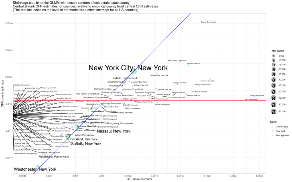
is the county label; the variance parameters use half-Cauchy priors and the fixed and random effects use normal priors. We estimate the model and generate posterior distributions for all parameters. The result for the United States using data over the summer is the figure below:

Summer 2020 geographical distribution of R-effective across the United States: 2020-07-01 to 2020-08-20.

Over the mid-summer, we see that the geographical distribution of R_{eff} across the US singles out the Midwestern states and Hawaii as hot-spots while Arizona sees no county with exponential growth. We have the beginnings of a US county based app which we hope to extend to other countries around the world. Unfortunately, count data on its own does not allow us to resolve the parameters of the compound Poisson process separately.

If we have complete information, which might be possible in a small community setting, like northern communities in Canada, prisons, schools, or offices, we can build a Gibbs sampler to estimate all the model parameters from data without having to rely on the asymptotic solution of the renewal equation.

Define a complete history of an outbreak as a set of N observations taking the form of a 6-tuple:

(14)   \begin{equation*}(i,j,B_{i},D_{i},m_{i},o_{i}),\end{equation*}

where,

i: index of individual, j: index of parent, B_{i}: time of birth, D_{i}: time of death, m_{i}: number of offspring birth events, o_{i}: number of offspring.

With the following summary statistics:

(15)   \begin{align*}L & = \sum_{i} D_{i} - B_{i};\,\,  \Lambda  = \prod_{i} (D_{i} - B_{i}) \nonumber \\ M & = \sum_{i} m_{i};\,\,  O = \sum_{i} o_{i} \nonumber \end{align*}

we can build a Gibbs sampler over the models parameters as follows:

(16)   \begin{align*}p\,|\,r,L,O & \sim \text{Beta}\left(a_{0} + O,b_{0} + r L\right) \nonumber \\r\,|\,p,L,M & \sim \text{Gamma}\left(\eta_{0}+M,\rho_{0}-L\log(1-p)\right) \nonumber \\b\,|\,a,L,N & \sim \text{Gamma}\left(\gamma_{0}+aN,\delta_{0}+L\right)\nonumber \\a\,|\,b,\Lambda,N & \sim\text{GammaShape}\left(\epsilon_{0}\Lambda,\zeta_{0}+N,\theta_{0}+N\right)\end{align*}

where a_0, b_0, \eta_0, \rho_0, \gamma_0, \zeta_0, \epsilon_0, \theta_0 are hyper-parameters.

Over periods of time that are comparable to the communicable window, such that increasing herd immunity effects are negligible, a pure branching process can describe the propagation of Covid-19. We have built a model that matches the features of this disease – high variance in infection counts from infected individuals with a random communicable period. We see promise in our model’s application to small population settings as an outbreak gets started.

An effective theory of Covid-19 propagation

To fight Covid-19, we need an understanding of how the virus propagates in a community. Right now, the workhorse engine in the literature and in the media are compartmental models: (S)usceptible (I)nfected (R)ecovered and its cousins. The most popular versions of these models start with a set of coupled ordinary differential equations which, when solved, generate paths for each compartment. For example, in the simple SIR model, the infection starts with a large susceptible population which diminishes as the infected population rises. The infected population eventually declines as the recovered population increases and eventually the infected population goes to zero as the outbreak ends. The differential equations govern the dynamics of each compartment, generating equations of motion for the population.

Covid-19 propagation as a gamma subordinated negative binomial branching process

SIR models work well when we are discussing large populations, when we are interested in population averages, and when the random nature of the transmission doesn’t particularly matter. The solution to the coupled set of differential equations is deterministic. But when an outbreak gets started or when we are interested in the dynamics in the small population limit, we need more than deterministic models. SIR compartmental model with its focus on averages is not enough when dealing with the very early stages of an outbreak – and it’s the early stages where we really want our mitigation strategies to be the most successful. We need a stochastic model of transmission to understand the early stages of an outbreak.

Together with my colleagues Jerome Levesque, and David Shaw, we built a branching model of Covid-19 propagation. The idea is that an infected person randomly infects other people over the course of the communicable period. That is, we model transmission by imagining that an infected person generates “offspring”, continuous in time, during the communicable period and that each “child” has the same statistical law for generate more “offspring”. The infections branch out from each infected person into a tree that makes up the infected community. So while on average an infected person will infect R0 other people (the basic reproduction number) during the communicable period, there are a range of possible outcomes. We could get lucky and an initially infected person might not spread the virus at all, or we could get unlucky and the initially infected person might become a super-spreader, all in a model with the same R0. In fact, even with R0>1, there can be a substantial probability that the outbreak will go extinct on its own, all depending on the statistical branching nature of transmission.

In some research communities, there is a tendency to use agent based models to capture the stochastic nature of an outbreak. Such models simulate the behaviour of many different individuals or “agents” in a population by assigning a complicated set of transmission rules to each person. In the quest for high fidelity, agent based models tend to have lots of parameters. While agent based approaches have merit, and they have enjoyed success in many fields, we feel that in this context these models are often too difficult to interpret, contain many layers of hidden assumptions, are extraordinarily difficult to calibrate to data while containing lots of identifiability issues, are easily susceptible to chaotic outputs, and obscure trade-off analysis for decision makers. In a decision making context we need a parsimonious model, one that gets the essentials correct and generates insight for trade-off analysis that decision makers can use. We need an effective theory of Covid-19 propagation in which we project all the complicated degrees of freedom of the real world down to a limited number of free parameters around which we can build statistical estimators.

The abstract of our paper:

We build a parsimonious Crump-Mode-Jagers continuous time branching process of Covid-19 propagation based on a negative binomial process subordinated by a gamma subordinator. By focusing on the stochastic nature of the process in small populations, our model provides decision making insight into mitigation strategies as an outbreak begins. Our model accommodates contact tracing and isolation, allowing for comparisons between different types of intervention. We emphasize a physical interpretation of the disease propagation throughout which affords analytical results for comparison to simulations. Our model provides a basis for decision makers to understand the likely trade-offs and consequences between alternative outbreak mitigation strategies particularly in office environments and confined work-spaces.

We focus on two parameters that decision makers can use to set policy: the average waiting time between infectious events from an infected individual, and the average number of people infected at an event. We fix the communicable period (distribution) from clinical data. Those two parameters go into the probabilistic model for branching the infection through the population. The decision maker can weigh trade-offs like restricting meeting sizes and interaction rates in the office while examining the extinction probabilities, growth rates, and size distributions for each choice.

You can find our paper here: https://medrxiv.org/cgi/content/short/2020.07.08.20149039v1

Covid-19 serology studies: a meta-analysis using hierarchical modelling

Serology studies are front-and-center in the news these days. Reports out of Santa Clara county, California, San Miguel County, Colorado, and Los Angeles suggest that a non-trivial fraction, more than 1%, of the population has SARS-CoV-2 antibodies in their bloodstream. European cities are following suit – they too are conducting serology studies and finding important fractions as well. The catch is that many of these studies find an antibody prevalence comparable to the false positive rate of their respective serology tests. The low statistical power associated with each study has invited criticism, in particular, that the results cannot be trusted and that the study authors should temper their conclusions.

But all is not lost. Jerome Levesque (also a federal data scientist and the manager of the PSPC data science team) and I performed a meta-analysis on the results from Santa Clara County (CA), Los Angeles County (CA), San Miguel County (CO), Chelsea (MA), Geneve (Switzerland), and Gangelt (Germany). We used hierarchical Bayesian modelling with Markov Chain Monte Carlo (MCMC), and also generalized linear mixed modelling (GLMM) with bootstrapping. By painstakingly sleuthing through pre-prints, local government websites, scientific briefs, and study spokesperson media interviews, we not only obtained the data from each study, but we also found information on the details of the serology test used in each study. In particular, we obtained data on each serology test’s false positive rate and false negative rate through manufacturer websites and other academic studies. We take the data at face value and we do not correct for any demographic bias that might exist in the studies.

Armed with this data, we build a generalized linear mixed model and a full Bayesian model with a set of hyper-priors. The GLMM does the usual shrinkage estimation across the study results, and across the serology test false positive/negative rates while the Bayesian model ultimately generates a multi-dimensional posterior distribution, including not only the false positive/negative rates but also the prevalence. We use Stan for the MCMC estimation. With the GLMM, we estimate the prevalence by bootstrapping with the shrunk estimators, including the false positive/negative rates. Both methods give similar results.

We find that there is evidence of high levels of antibody prevalence (greater than 1%) across all reported locations, but also that a significant probability mass exists for levels lower than the ones reported in the studies. As an important example, Los Angeles show a mode of approximately 4%, meaning that about 400,000 people in that city have SARS-CoV-2 antibodies. Given the importance of determining societal-wide exposure to SARS-CoV-2 for correct inferences of the infection fatality rate and for support to contact tracing, we feel that the recent serology studies contain an important and strongly suggestive signal.

Our inferred distributions for each location:

Prevalence density functions (marginal posterior distribution) from the Bayesian MCMC estimation.
Prevalence density functions from the GLMM bootstrap.
Prevalence with the false positive rate (Bayesian MCMC).
Prevalence with the false positive rate (GLMM bootstrap).

Covid-19: A case fatality rate app for US counties

I made a web app on estimating the case fatality rate (CFR) of Covid-19 across all the US counties. I use a binomial GLMM with nested random effects (state, state:county) using the R package lme4. Every time you reload the app, it fetches the most recent data and re-estimates the model.

The model “shrinks” the simple CFR estimates (dividing deaths by cases) at the county level by “learning” across the other counties within the state and by “learning” across the states themselves. The model pulls in or pushes out estimates that are too large or too small because they come from a county with a small sample size. It’s a bit like trying to estimate the true scoring rate of the NHL teams after watching only the first 10 games of the season. There will be a couple of blow-outs and shut-outs and we need to correct for those atypical results in small samples – but we should probably shrink the Leafs ability to score down to zero just to be safe 😉

The CFR data has limitations because the people who get tested are biased toward being sick, often very sick. The infection fatality rate (IFR), which is what we all really want to know, requires testing far more people. Recent evidence suggests that the IFR will end up much lower than the current CFR estimates.

The app shows the how the naive empirical estimate of the CFR compares to the shrunk estimator from the model. I also provide a forest plot to show the prediction intervals of the model estimates, including the contributions from the random effects. The prediction intervals I report are conservative. I use R’s merTools predictInterval() to include uncertainty from the residual (observation-level) variance, and the uncertainty in the grouping factors by drawing values from the conditional modes of the random effects using the conditional variance-covariance matrix. I partially corrected for the correlation between the fixed and random effect. Prediction interval estimation with mixed models is a thorny subject and short of a full Bayesian implementation, a full bootstrap of the lme4 model is required for the best estimates of the prediction interval. Unfortunately, bootstrapping my model takes too long for the purposes of my app (and so does the MCMC in a Bayesian implementation!). For details on use of the use of merTools::predictInterval(), see Prediction Intervals from merMod Objects by Jared Knowles and Carl Frederick.

Hopefully Covid-19 will pass soon. Stay safe.