
As we are all dealing with self-isolation and social distancing in our fight against Covid-19, I thought that I would apply some quick-and-dirty mixed effects modelling with the Covid-19 case fatality rate (CFR) data.
The Centre for Evidence Based Medicine (CEBM), Nuffield Department of Primary Care Health Centre, University of Oxford (not far from my old stomping grounds on Keble Road) has put together a website that tracks the Covid-19 CFR around the world. They build an estimator using a fixed-effect inverse-variance weighting scheme, a popular method in meta-analysis, reporting the CFR by region as a percentage along with 95% confidence intervals in a forest plot. The overall estimate is suppressed due to heterogeneity. In their analysis, they drop countries with fewer than four deaths recorded to date.
I would like to take a different approach with this data by using a binomial generalized mixed model (GLMM). My model has similar features to CEBM’s approach, but I do not drop any data – regions which have observed cases but no deaths is informative and I wish to use all the data in the CFR estimation. Like CEBM, I scrape https://www.worldometers.info/coronavirus/ for the Covid-19 case data.
In one of my previous blog posts I discuss the details of GLMM. GLMM is a partial-pooling method with group data which avoids the two extreme modelling approaches of pooling all the data together for a single regression or running separate regressions for each group. Mixed modelling shares information between groups, tempering extremes and lifting those groups which have little data. I use the R package lme4, but this work can be equally done in a full Bayesian setup with Markov Chain Monte Carlo. You can see a nice illustration of “shrinkage” in mixed effects models at this site.
In my Covid-19 CFR analysis, the design matrix, X, consists of only an intercept term, the random effects, b, have an entry for each region, and the link, g(), is the logit function. My observations consist of one row per case in each region with 1 indicating the observation of death, otherwise 0. For example, at the time of writing this post, Canada has recorded 7,474 cases with 92 deaths and so my resulting observation table for Canada consists of 7,474 rows with 92 ones and 7,382 zeros. The global dataset expands to nearly 800,000 entries (one for each case). If a country or region has not recorded a death, the table for that region consists of only zeros. The GLMM captures heterogeneity through the random effects and there is no need to remove zero or low count data. The GLMM “shrinks” estimates via partial-pooling.
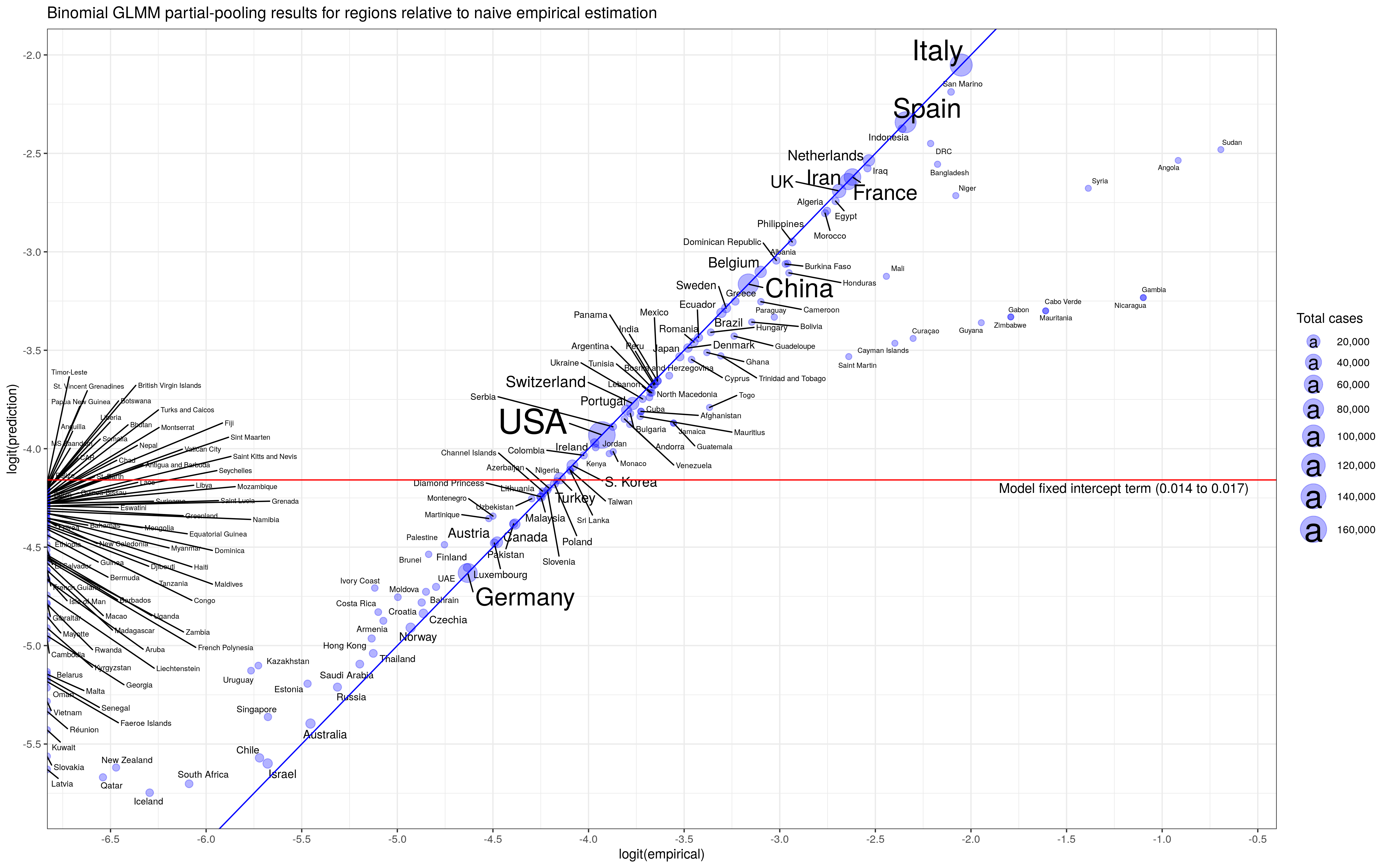
Below are my results. First, we see that the fixed effect gives a global CFR of (1.4% to 1.7%) 95% CI. This CFR is the base rate that every region sees but with its random effect that sits on top. The random effect has expectation zero, so the base CFR is the value we would use for a new region that we have not seen before and has no data yet (zero cases). Notice that, we will have a non-zero CFR for regions that have yet to observe a death over many cases – the result of partial pooling.
In the second graph we see the effect of “shrinkage” on the data. The central value for the CFR from separate regressions for each region is the x-axis (labelled empirical) while the predicted value from the GLMM is on the y-axis. Estimates that sit on the 45-degree share the same value (which we expect for regions with lots of data, less “shrinkage”). We see that regions with little data – including the group on the far left – are lifted.
I like the GLMM approach to the Covid-19 CFR data because there is so much heterogeneity between regions. I don’t know the source of that heterogeneity. Demographics is one possible explanation, but I would be interested in learning more about how each country records Covid-19 cases. Different data collection standards can also be a source of large heterogeneity.
I welcome any critiques or questions on this post. I will be making a Shiny app that updates this analysis daily and I will provide my source code.


 is a monotonic link function,
  contains the random effects with zero expected value and with a covariance matrix
  parameterized by
  . A generalized additive model uses this structure, but the design matrix
  is built from spline evaluations with a “wiggliness” penalty, not on the regressors directly (coefficients correspond to the coefficients of the spline). For details, see Generalized Additive Models: An Introduction with R, Second Edition.
 ,
,  ,
,  is a cyclic cubic smoothing spline that captures seasonal temperature variation on a 365 day cycle, and
  is a smoothing spline that tracks a temperature trend, if any. I’m not an expert in modelling climate change, but this type of model seems reasonable – we have a seasonal component, a component that captures daily autocorrelations in temperature through an AR(2) process, and a possible trend component if it exists. To speed up the estimation, I nest the AR(2) residual component within year.
